IoT Sensor Combines with AI to Improve Safety in Public Buildings
IoT Sensor Combines with AI to Improve Safety in Public Buildings

In the fast-paced world of retail, staying ahead of the curve is not just a choice; it’s a necessity. In this era of technological advancements, one factor plays a pivotal …

IntelliRange™ describes the collection of technologies, know-how, and capabilities that drive the performance of Nextivity HPUE products. Nextivity (Assured Wireless) launched the first commercially available and widely adopted 3GPP Power …

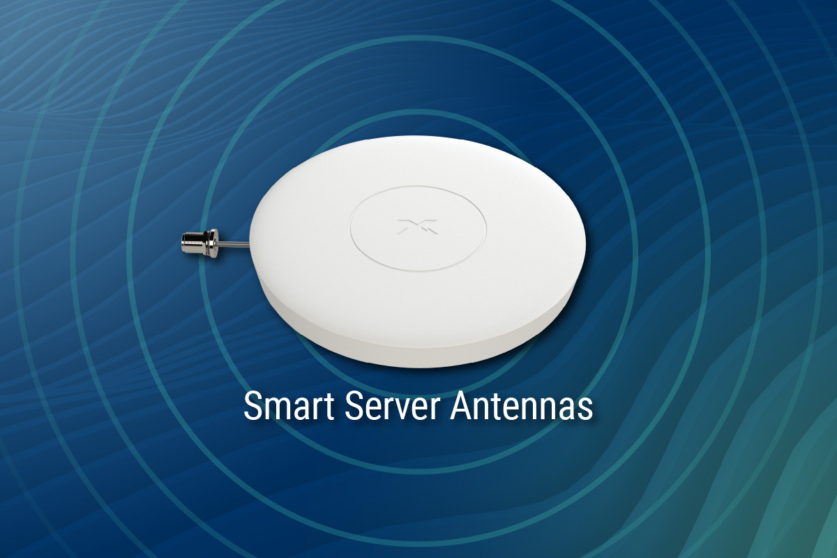
What is Active DAS Hybrid? Active DAS Hybrid is a unique distributed antenna system (DAS) category that provides outstanding network coverage using active signal amplification components at an affordable cost. …
5G is not a specific technology. It is a collection of services that can be enabled by a set of technologies. These include Enhanced Mobile Broadband, Ultra Reliable and Low Latency Communication, and Massive Machine Type Communications.
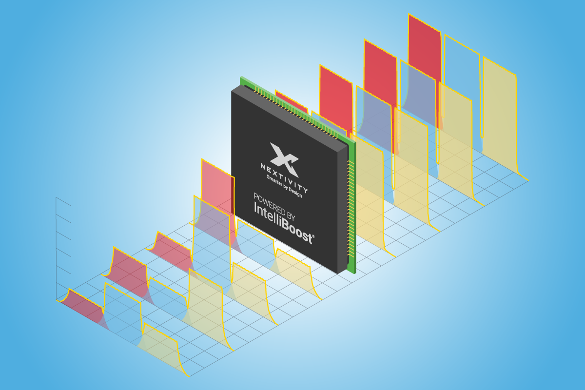
The Making of Nextivity Smart Coverage Solutions IntelliBoost® describes the collection of knowledge, technology, features, and functions that set Nextivity products apart from “dumb” repeaters. IntelliBoost is what makes Nextivity …

Since the 1970’s, the frequency of natural disasters has risen four-fold to an average of 13 per year. Coupled with a similar rise in the number of manmade disasters, our …

Nextivity CCO joins podcast by Mission Critical Magazine to discuss why in-building cellular coverage is necessary for data centers, warehouses, and other enterprise environments.

Nextivity demystifies in-building cellular networks and explains how CEL-FI solutions shorten time-to-value from months to weeks

“Network infrastructure including fibre broadband and Wi-Fi access points are factored into all new building projects from the outset, with mobile coverage infrastructure taking second place. Both should be given equal status in a world driven by tech,” says Colin Abrey of Nextivity.

“Network infrastructure including fibre broadband and Wi-Fi access points are factored into all new building projects from the outset, with mobile coverage infrastructure taking second place. Both should be given equal status in a world driven by tech,” says Colin Abrey of Nextivity.

Beyond smartphone-specific use cases, cellular coverage inside buildings is key to unlocking the vast potential of the internet of things and deriving the value that flows from real-time, data-driven decision …

In the latest episode of this podcast series, Nextivity’s COO Stephen Kowal discusses how in-building cellular coverage underlines the digital transformation of key verticals. Beyond talk, text and data, cellular coverage …
In the latest episode of this series, Nextivity’s Stephen Kowal, chief commercial officer, goes over the company’s unique approach to hybrid active DAS and how this differs from traditional DAS. Kowal …
In this limited series presented in partnership between RCR Wireless News and Nextivity, we explore how in-building cellular coverage is a fundamental piece of enterprise digital transformation that is less …

System integrators are an essential part of Nextivity’s ecosystem and are integral to the company delivering exceptional in-building cellular coverage. From high-rises, complexes, and multi-use buildings to multi-family dwellings and …

Nextivity is committed to supporting important partnerships with carriers and has successfully completed the rigorous approval process for its CEL-FI line of in-building cellular coverage solutions by more than 200 …

CEL-FI Increases Safety at Texas School District The Challenge An independent, Texas-based school district comprised of 33 educational institutions including elementary, middle, and high schools needed to resolve its cellular …

30 ‘Telstra Go’ mobile repeaters for Kangaroo Island emergency services Telecommunications for Kangaroo Island emergency service personnel should improve thanks a generous donation from the Uniting Church KI Bushfire Fund. …

By: Michiel Lotter, CEO of Nextivity There is a level of excitement and optimism brewing in the telecom space, especially around 5G and the massive potential it offers. We expect …